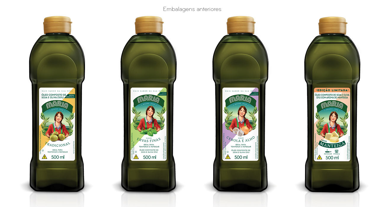
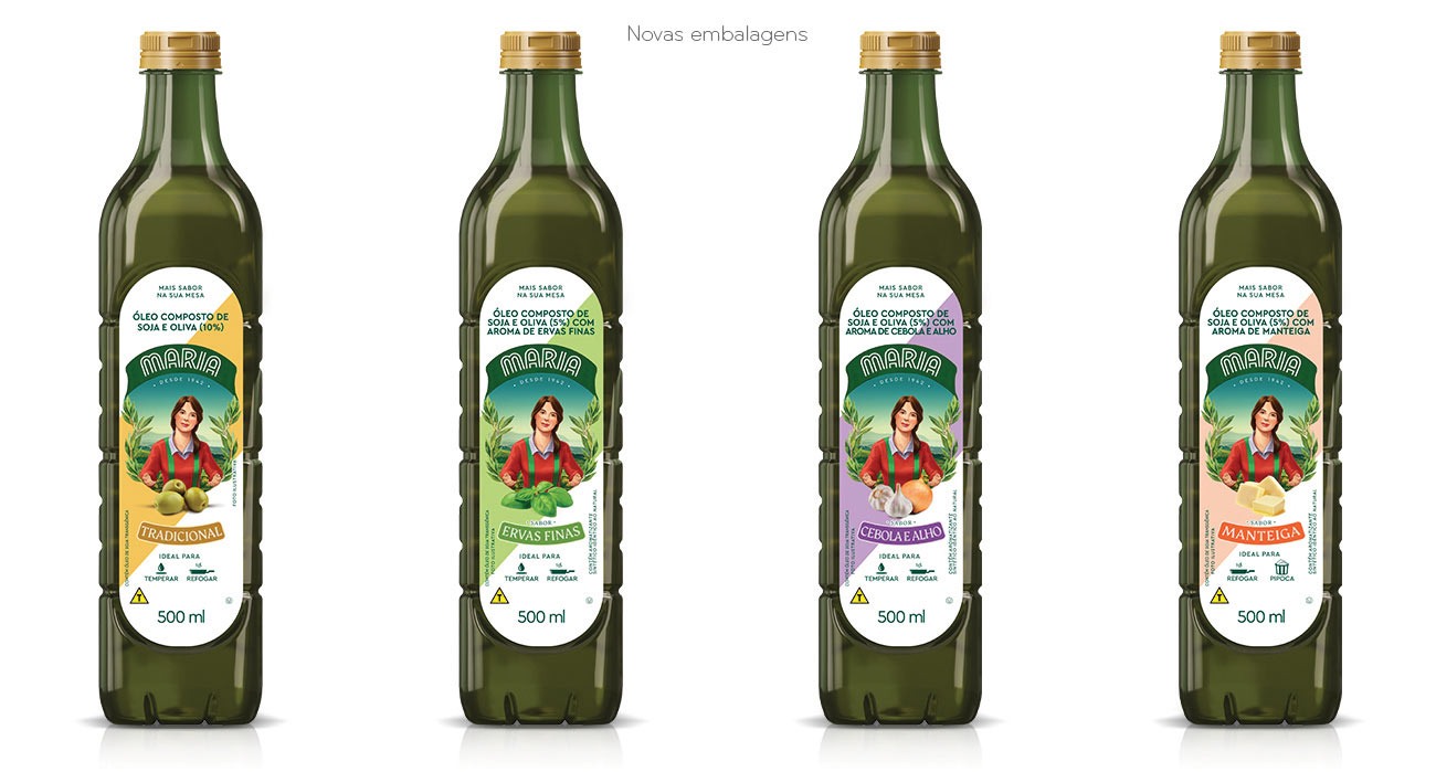
The packaging for Maria compound oil has been revitalized with a new bottle, featuring a modern and functional design that enhances both aesthetics and usability.
This update required a complete label review to ensure a seamless fit while effectively communicating the product’s attributes and benefits.
WHAT WAS DONE:
The label artwork was updated to perfectly align with the new bottle format, refining the layout of graphic and text elements for a more cohesive and visually appealing design. The front label was redesigned to include intuitive icons that clearly indicate the product’s recommended use, making it easier for consumers to understand at a glance.
To improve flavor visibility, we conducted a study that led to the introduction of a dedicated color-coded module, allowing for quick identification and a more intuitive shopping experience. Additionally, all label information was updated to ensure full compliance with the latest Anvisa regulations, reinforcing both transparency and consumer trust.