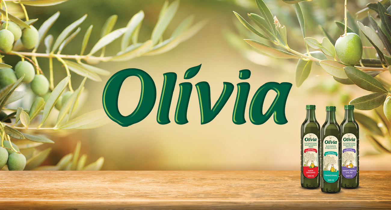
With the aim of modernizing the visual identity, we redesigned the brand and packaging of Olívia compound oils, maintaining its essence already known and loved by consumers.
WHAT WAS DONE:
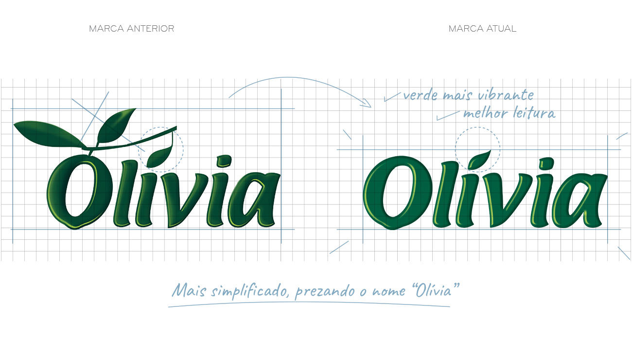
We started the project by redesigning the Olivia brand, focusing on simplifying some elements to make it more contemporary and visually appealing. The process involved refining the brand.
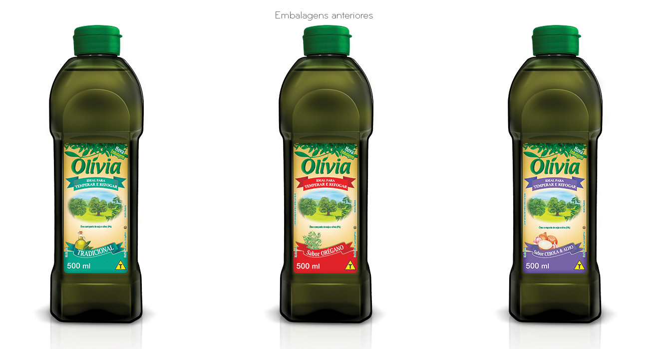
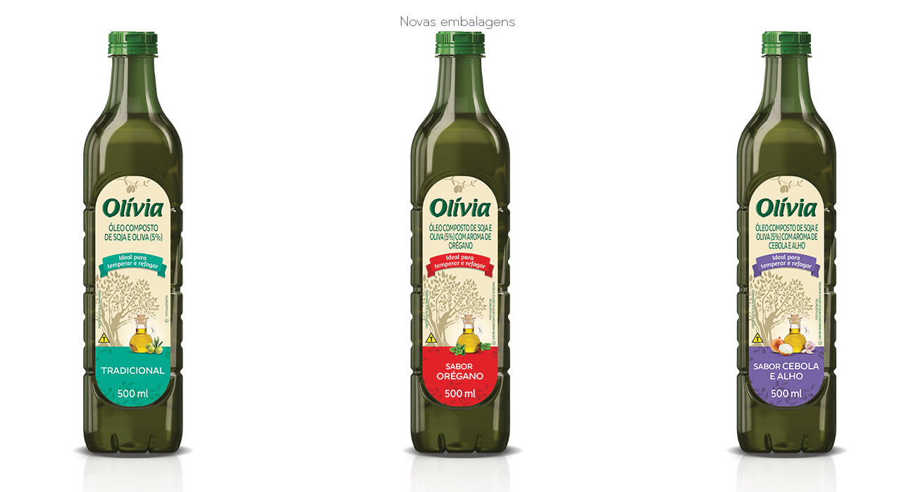
After redesigning the brand, we moved on to creating new packaging for Olívia compound oils. The challenge was to modernize the packaging without losing the brand’s character.
The tree, an important symbol of the brand, was kept as the central element. However, it was redesigned in a more stylized way, with fewer details, to give it a cleaner and more modern look.
We retained the original color codes from the previous packaging to ensure a sense of familiarity for consumers. The background color was refreshed with more modern tones, while the main color palette was preserved to maintain visual continuity.
We incorporated illustrative images of the ingredients in each product to emphasize the quality and purity of Olívia’s compound oils. These carefully selected and positioned photos enhance the stylized tree design, creating a harmonious blend of visuals and information.