We developed the Key Visual for the Panda Plus line, a brand that brings imported products from China to Brazil, focusing on quality and added value.
The challenge was to create a visual identity that conveys sophistication and trust, highlighting the products at the point of purchase and strengthening the brand’s presence in the Brazilian market.
WHAT WAS DONE:
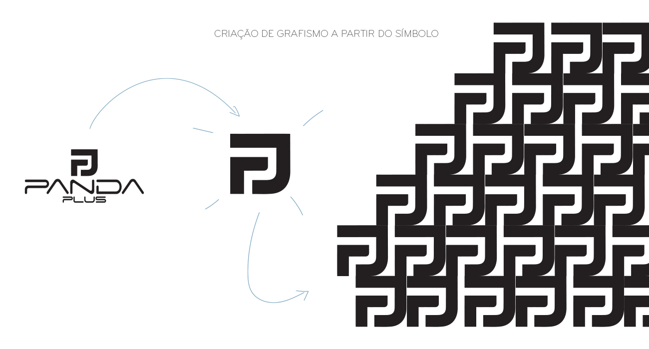
We used the Panda Plus logo symbol as the starting point to create a proprietary Key Visual, designed to enhance brand recognition and build a strong visual territory for its products.
From this foundation, we developed an exclusive pattern applied as a supporting graphic element on the packaging, creating visual consistency across the entire product line. This approach gave the products more visibility, a strong identity, and helped differentiate the brand at retail.
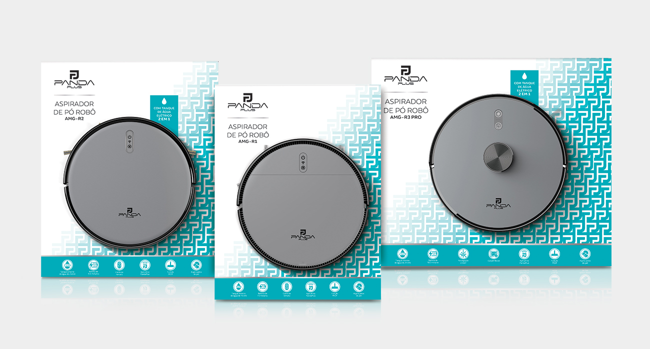
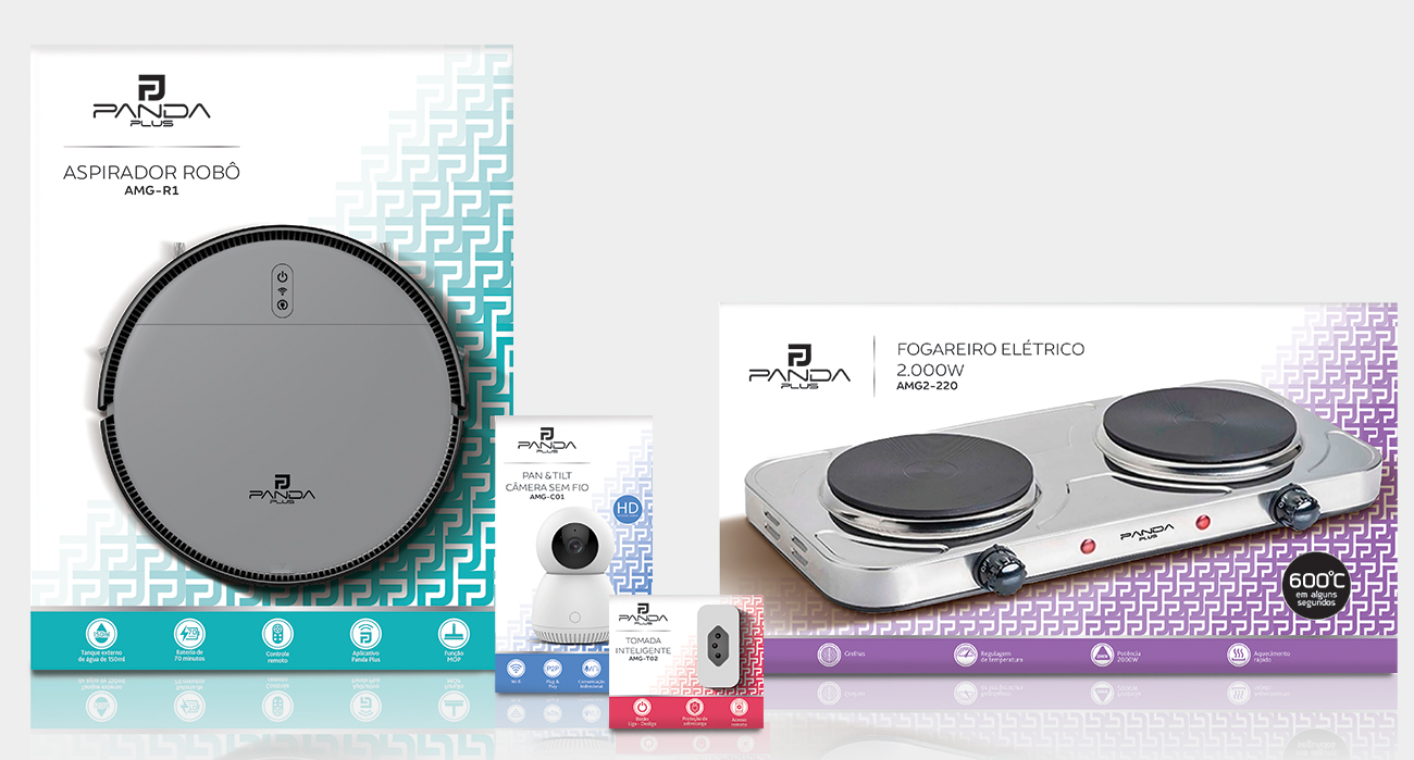
We conducted a detailed color code study to segment Panda Plus into four distinct product lines, making it easier for consumers to identify and choose the right product at the time of purchase.
The packaging design balanced the use of the pattern with clean white space, resulting in a modern, sophisticated, and clear look.
Silver gradient elements were applied between the logo and product names, as well as in the main claims on the front panel, reinforcing the perception of quality and highlighting the benefits of each item.